
Experimenting with Technical Indicators and Error Events
I have been doing some serious data digging over this last week - mostly
related to tracing some arcane functionality and an associated issue with a
data feed. The work was pretty time consuming, so while the SQL was running,
I had some time to think and experiment. Though we knew there was an issue
with the data, its impact was not really visible through our reporting tool.
Low number of occurrences. Steadily climbing counts, but with pretty low
deviation. I needed a way to expose what we thought was happening via a
meaningful and actionable indicator.
In a previous incarnation, this blog was actually called “the passive investor” and mainly recorded my approach to dividend investing. That work was backed by a pretty intense suite of excel workbooks. Yes, I am well aware that there are online tools that do charting and amazing analysis of stocks for you. Problem was, I needed some way to analyze my entire asset base, so off to the world’s most powerful DSL … Excel.
I dug up some of my old worksheets.
Hacked a little bit. Made some bulk data queries, thank you pivot tables, and
BAM. I was in business.
The data in this case was simply an aggregation of an event by date.
I began with the theory that
Bollinger Bands would likely
provide a solid starting point given that they are geared toward volatility
analysis.
As you can see, the
Bollinger Bands would not have given confirmation of the impact of our issue,
which started November 1, until the sharp change in trend mid-december.
Though the volatility was increasing, noted by widening bands, that fact could
be discounted by the low counts from Veteran’s Day and Thanksgiving. Given
the slow signaling from this daily aggregation, I moved on.
Next up on the docket was to try a stochastic oscillator, figuring that the change in momentum might yield some key visual indicator.
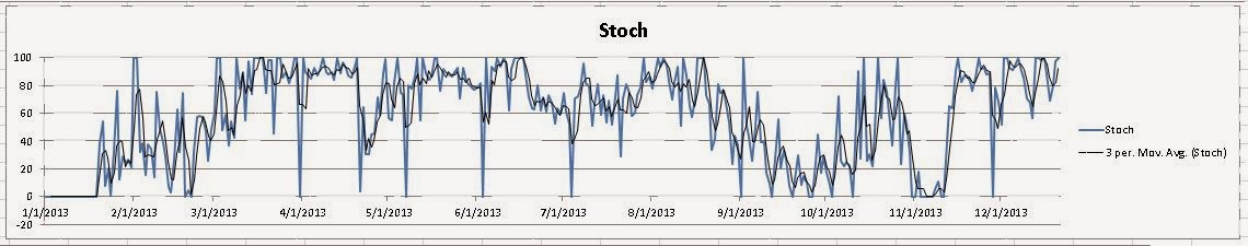
Unfortunately, this chart is next to useless. I honestly have no clue what it is trying to tell me. I could likely extend the %D and the %K or take an EMA to slow the oscillations down; but, I still don’t think this is what I am looking for.
I moved onto the MACD indicator figuring that the simple two period moving average and overlaid histogram would show “fast” changes in trend better than the Bollinger Bands. Judging by the image blow I think my conclusions are right.
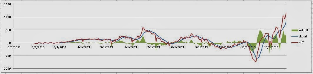
We would have received positive confirmation of the issue by mid November, mainly due to
this indicator’s simplicity. It’s easy to calculate. And easy to read.
Though it suffers from some latency issues similar to the Bollinger Bands
above, it’s a moving average indicator after all, the chart reads very clearly
and I think provides some actionable data. I will need to work on providing
some % deviation clamping around very low transaction days (Veteran’s,
Thanksgiving); and additionally, see if the data team can provide some
evidence for the mid-June spike.
One further thought that I have yet to experiment with, is the use of volume technical indicators on log data. My hunch is that they might be well suited for looking at transaction times, processing duration, etc.
At this point, I plan on implementing a small MongoDB instance to store a nightly data rollup for the MACD chart. Perhaps an experiment with Matplotlib and a light weight python web framework is in order? Thoughts?